Is Green A Warm Color Or Cool
Arias News
Mar 28, 2025 · 5 min read
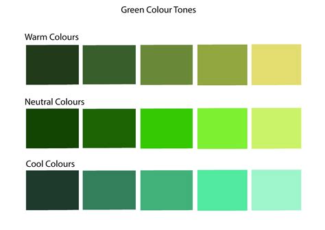
Table of Contents
Is Green a Warm Color or Cool? Decoding the Chromatic Conundrum
The question of whether green is a warm or cool color is far from straightforward. Unlike the stark contrast between fiery red and icy blue, green occupies a fascinating middle ground, its temperature shifting depending on a multitude of factors. This isn't simply a matter of subjective opinion; the perception of green's temperature is influenced by its hue, saturation, value, and even the surrounding colors. This article delves deep into the chromatic complexities of green, exploring the scientific and psychological aspects that contribute to our perception of its warmth or coolness.
Understanding the Color Wheel and Temperature
The traditional color wheel, a fundamental tool in art and design, arranges colors based on their hue. While this arrangement doesn't inherently define temperature, it provides a framework for understanding the relationship between colors. Warm colors, typically reds, oranges, and yellows, are associated with sunlight, fire, and warmth. Cool colors, blues, purples, and greens (in certain instances), are linked to water, ice, and shade.
However, the color wheel alone can't definitively answer whether green is warm or cool. Its position between blue (cool) and yellow (warm) places it at a crucial juncture, creating a spectrum of possibilities.
The Role of Hue
The specific hue of green significantly impacts its perceived temperature. Yellow-greens, leaning closer to yellow on the color wheel, tend to feel warmer and more vibrant. Think of the sunny hues of fresh spring leaves or a ripe lime. These greens evoke feelings of sunshine and growth, making them perceptually warm.
In contrast, blue-greens, closer to blue on the color spectrum, are considerably cooler. These greens remind us of the deep ocean, a tranquil forest, or a cool, shaded area. Their association with calmness and serenity reinforces their cool perception.
Examples of Warm Greens: Chartreuse, lime green, olive green (depending on its shade).
Examples of Cool Greens: Teal, seafoam green, jade (depending on its shade).
The Influence of Saturation and Value
Beyond hue, saturation and value play crucial roles in determining the perceived temperature of green.
Saturation: The Intensity Factor
Saturation refers to the intensity or purity of a color. A highly saturated green, a bold and vivid hue, will generally feel warmer than a desaturated, muted green. Think of the difference between a bright emerald green and a dusty sage green. The emerald, being more saturated, feels more vibrant and warmer. Conversely, a less saturated green appears duller and cooler.
Value: Lightness and Darkness
Value represents the lightness or darkness of a color. Lighter greens, closer to white on the value scale, often appear warmer and more cheerful. They evoke images of springtime, new growth, and optimism. Darker greens, closer to black on the value scale, typically feel cooler and more mysterious. Think of a deep forest or the shadowy depths of a jungle.
Contextual Factors: The Surroundings Matter
The surrounding colors significantly impact the perceived temperature of any given green. A green placed next to warm colors like oranges and reds will appear cooler by contrast. Conversely, a green surrounded by cool blues and purples will appear relatively warmer. This is a phenomenon of simultaneous contrast, where colors influence each other's perception.
Psychological Associations and Cultural Influences
Our perception of color is not purely objective; it's heavily influenced by our cultural background and personal experiences. Certain greens hold specific cultural significance, which can sway our perception of their warmth or coolness. For example:
- Emerald Green: Often associated with wealth and luxury, it might feel warmer due to its positive connotations.
- Forest Green: The deep, shadowed shades of a forest might evoke a feeling of coolness and mystery.
- Olive Green: This earthy tone can feel both warm and cool, depending on its specific shade and context.
These associations, learned through experience and cultural exposure, add another layer of complexity to the debate of green's temperature.
Green in Different Contexts: Art, Design, and Nature
The perceived temperature of green varies significantly depending on its application.
Green in Art
Artists manipulate hue, saturation, and value to create a vast range of green shades, each with its own unique temperature. From the vibrant greens of Impressionist landscapes to the muted greens of still life paintings, the use of green reflects the artist's intention and overall mood.
Green in Design
In interior design and fashion, green is used to create a variety of atmospheres. Warm greens are often used to create inviting and energizing spaces, while cool greens can evoke tranquility and serenity. The choice of green depends heavily on the desired mood and overall aesthetic.
Green in Nature
In the natural world, green's temperature is intrinsically linked to its environment. The bright green of new leaves in spring feels warm and vibrant, contrasting with the cool, deep greens of a winter forest. The variations in natural greens demonstrate the wide range of temperatures a single color can convey.
Scientific Explanation: Wavelengths and Perception
The scientific explanation for color perception lies in the wavelengths of light. Different wavelengths of light stimulate different cones in our eyes, resulting in our perception of color. While green occupies a specific wavelength range, the precise wavelength and its intensity influence the final perception of warmth or coolness. The complexities of human perception, including individual variations in cone sensitivity, further complicate this simple model.
Conclusion: The Elusive Temperature of Green
Ultimately, declaring green definitively as warm or cool is an oversimplification. It's a color that defies easy categorization, existing in a dynamic space influenced by numerous factors. Its hue, saturation, value, context, and cultural associations all play significant roles in shaping our perception of its temperature. Instead of focusing on a single label, it’s more insightful to appreciate the diverse range of temperatures green can express, making it a versatile and compelling color in art, design, and the natural world. Understanding these nuances allows for a more informed and nuanced appreciation of this complex and fascinating color. The beauty of green lies in its ambiguity, its ability to shift and adapt, reflecting the multifaceted nature of our perception and experience.
Latest Posts
Latest Posts
-
How To Play The Recorder Hot Cross Buns
Mar 31, 2025
-
Protein In 8 Oz Chicken Breast Cooked
Mar 31, 2025
-
Why Is It Called A Handle Of Alcohol
Mar 31, 2025
-
How Long Does Egg Nog Last After Opening
Mar 31, 2025
-
How High Is A Story In A Building
Mar 31, 2025
Related Post
Thank you for visiting our website which covers about Is Green A Warm Color Or Cool . We hope the information provided has been useful to you. Feel free to contact us if you have any questions or need further assistance. See you next time and don't miss to bookmark.
