The Lightness Or Darkness Of A Color
Arias News
Mar 18, 2025 · 7 min read
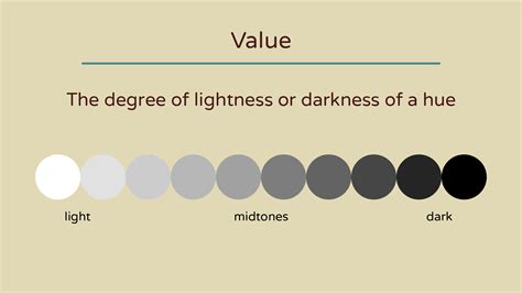
Table of Contents
The Lightness or Darkness of a Color: Understanding Value in Art and Design
The lightness or darkness of a color, technically known as value, is a fundamental element in art and design. It's often overlooked in favor of vibrant hues and striking saturation, but mastering value is crucial for creating depth, dimension, and visual impact in any artwork or design project. Understanding how value works allows you to control the mood, guide the viewer's eye, and create a more compelling and professional final product. This comprehensive guide explores the intricacies of value, from its technical definition to its practical applications.
What is Value in Color?
Value, in the context of color, refers to the relative lightness or darkness of a color. It ranges from pure white (highest value) to pure black (lowest value), with all the shades of gray in between. This is independent of hue (the actual color, like red or blue) and saturation (the intensity or purity of the color). A color's value significantly impacts how it is perceived. A bright red can appear very different depending on its value – a high-value red appears light and airy, while a low-value red appears dark and intense.
The Importance of Value in Visual Art
Value plays a crucial role in various aspects of visual communication:
-
Creating Depth and Dimension: By manipulating value, artists can create the illusion of three-dimensionality on a two-dimensional surface. This is achieved through techniques like shading, highlighting, and modeling, where variations in value suggest form and volume. A dark value on one side of an object implies shadow, while a light value suggests a highlight, creating a sense of roundness and depth.
-
Establishing Mood and Atmosphere: Value contributes significantly to the overall mood of an artwork. Dark values often create a feeling of mystery, drama, or seriousness, whereas light values can suggest happiness, serenity, or optimism. The skillful use of value can dramatically influence the emotional response of the viewer.
-
Guiding the Viewer's Eye: Strategic placement of light and dark values can draw attention to specific areas of a composition. A focal point can be emphasized by using a strong contrast of light and dark around it. Conversely, areas of less importance can be de-emphasized by using similar values.
-
Creating Balance and Harmony: The distribution of values throughout a composition contributes to its overall balance and harmony. A balanced composition uses values in a way that feels pleasing and visually stable. Understanding value distribution helps to avoid compositions that feel overly heavy or unbalanced.
-
Adding Realism and Detail: The subtle variations in value used in realistic rendering contribute significantly to the level of detail and realism achieved. Precise value transitions can bring out the texture of surfaces, the wrinkles in fabric, or the contours of a face.
Value Scales and Their Applications
Artists and designers often use value scales to visualize and understand value relationships. A value scale is a visual representation of the gradual transition from white to black, demonstrating the range of values. These scales are incredibly helpful for:
-
Mixing Paints: When using paint, a value scale helps ensure consistent transitions in tone. It aids in mixing shades and tints accurately, avoiding jarring shifts in value.
-
Understanding Contrast: A value scale showcases the difference between various values, making it easier to see how much contrast you need for a particular effect.
-
Planning a Composition: Before starting a painting or drawing, creating a preliminary value sketch using a value scale can help to plan the composition and the light source.
Types of Value Scales
Several types of value scales exist:
-
Simple Grayscale Value Scale: This is the most basic type, showing a gradual transition from pure white to pure black through various shades of gray.
-
Value Scale with Color: This involves creating a value scale using a specific hue, allowing you to see how that hue changes in value from light to dark.
-
Broken Value Scale: This scale uses various values in a less linear fashion, with more variation and uneven transitions. It provides a more naturalistic and less predictable value structure.
Measuring Value: Quantifying Lightness and Darkness
While value is often perceived subjectively, there are ways to quantify it. Color theory often uses numerical systems to define value. Some common methods include:
-
Percentage of White or Black: Value can be expressed as a percentage of white or black in a given color. For example, a 70% value would be closer to white, while a 30% value would be closer to black.
-
Numerical Scales (0-10): A numerical scale assigns a number to each value, with 0 representing black and 10 representing white.
Applying Value in Different Media
The approach to value manipulation varies based on the medium being used:
Painting
In painting, value is controlled through the mixing of colors and the application of paint. Thick application of paint can create darker values, while thin washes can create lighter ones. Glazing, layering transparent washes of color over each other, is a powerful technique for controlling value and adding depth.
Drawing
In drawing, value is achieved using pencils, charcoal, or other drawing materials. The pressure applied to the drawing tool determines the darkness or lightness of the mark, allowing for precise value control. Techniques like hatching and cross-hatching create value through the density of lines.
Digital Art
Digital art offers extensive control over value through various tools and settings. Adjustment layers, curves, and levels can precisely adjust the value range of an image, while brushes and blending modes offer fine-grained control.
Value and Contrast: A Dynamic Duo
Value works in tandem with contrast to create visual interest and impact. Contrast refers to the difference between values, from subtle gradations to stark opposites. High contrast emphasizes differences, creating a dramatic and eye-catching effect. Low contrast creates a more subdued and harmonious feel. Mastering contrast is vital for creating visually compelling work.
Types of Contrast
-
Value Contrast: The most basic type, focusing on the difference in lightness and darkness between areas.
-
Simultaneous Contrast: This occurs when two colors placed next to each other influence each other's perceived value. A lighter color next to a darker color might appear even lighter, and vice versa.
-
Color Contrast: While not directly related to value, color contrast can enhance or detract from value relationships. High color contrast can sometimes overshadow subtle value differences.
Advanced Value Techniques
Beyond basic shading and highlighting, more advanced value techniques exist:
-
Chiaroscuro: An Italian term referring to the dramatic use of light and shadow to create a three-dimensional illusion, often with strong contrasts.
-
Sfumato: A technique, particularly popular in Renaissance painting, using subtle gradations of value to create a soft, hazy effect, often to soften outlines and create atmosphere.
-
Tenebrism: A style that utilizes strong contrasts between light and dark, often employing deep shadows to focus attention on a highlighted area.
Value in Design: Beyond Fine Art
Value principles extend beyond traditional art forms and play a significant role in graphic design, web design, and user interface (UI) design. In these fields, value helps with:
-
Readability: Proper value contrast is essential for ensuring the readability of text. Sufficient contrast between text and background is crucial for accessibility.
-
Hierarchy and Emphasis: Using value to create visual hierarchy guides the viewer's eye through the design. Important elements can be highlighted with lighter values, while less important elements are in darker values.
-
Creating Visual Interest: Strategic use of value enhances the visual appeal of designs, making them more engaging and memorable.
Conclusion: The Underrated Power of Value
While color, hue, and saturation often command attention, understanding and mastering value is essential for creating impactful visual work. It is a cornerstone of artistic expression and effective design, enabling artists and designers to achieve realism, convey emotions, guide the viewer's gaze, and craft visually compelling compositions. By dedicating time and effort to learning and practicing value techniques, you can significantly improve your artistic and design skills, creating richer, more dynamic, and ultimately, more successful work. From subtle gradations to stark contrasts, the skillful manipulation of value unlocks a world of creative possibilities. Remember to practice regularly, experiment with different techniques, and observe the world around you to understand how light and shadow interact to create value in everyday life. This keen observation will significantly enhance your ability to translate these observations into compelling artwork.
Latest Posts
Latest Posts
-
How Do You Say Emma In Spanish
Mar 18, 2025
-
6 Ounces Of Water Is How Many Cups
Mar 18, 2025
-
What Year Would I Be Born If I Was 14
Mar 18, 2025
-
Born In 1961 How Old Am I
Mar 18, 2025
-
How Many 1 5 Ounce Shots In A Liter
Mar 18, 2025
Related Post
Thank you for visiting our website which covers about The Lightness Or Darkness Of A Color . We hope the information provided has been useful to you. Feel free to contact us if you have any questions or need further assistance. See you next time and don't miss to bookmark.
