Where Does The Dependent Variable Go On A Graph
Arias News
Mar 22, 2025 · 5 min read
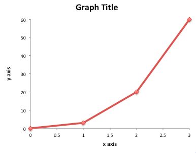
Table of Contents
Where Does the Dependent Variable Go on a Graph? A Comprehensive Guide
Understanding where to place your dependent variable on a graph is fundamental to effectively communicating scientific findings and data analysis. This seemingly simple question underlies the core principles of data visualization and is crucial for interpreting results accurately. This guide will provide a comprehensive explanation of the placement of dependent variables on graphs, covering various graph types and offering practical examples to solidify your understanding.
The Fundamentals: Independent vs. Dependent Variables
Before diving into graph construction, it's essential to revisit the definitions of independent and dependent variables. This distinction forms the bedrock of experimental design and dictates how your data is presented visually.
-
Independent Variable (IV): This is the variable that is manipulated or changed by the researcher. It's the cause in a cause-and-effect relationship. Think of it as the variable you control.
-
Dependent Variable (DV): This is the variable that is measured or observed. It's the effect in a cause-and-effect relationship. It depends on the changes made to the independent variable. It's the variable you observe.
For example, in an experiment investigating the effect of fertilizer on plant growth, the:
- Independent Variable: Amount of fertilizer applied (you control how much fertilizer is used).
- Dependent Variable: Plant height (you observe the height as a result of the fertilizer).
Graph Types and Variable Placement
Different graph types are suited to visualizing different relationships between variables. The placement of the dependent and independent variables, however, remains consistent across most commonly used graphs.
1. Line Graphs
Line graphs are ideal for displaying data that shows a continuous relationship between variables over time or across a range of values. In a line graph:
- Independent Variable: Plotted on the x-axis (horizontal axis). This represents the time or the continuous variable that you are manipulating.
- Dependent Variable: Plotted on the y-axis (vertical axis). This represents the measured outcome that changes in response to the independent variable.
Example: A line graph showing plant growth (DV) over time (IV) would have time on the x-axis and plant height on the y-axis. Each data point represents a measurement of plant height at a specific time.
2. Scatter Plots
Scatter plots are used to show the relationship between two variables, where one is not necessarily directly influencing the other. While causality might not be explicitly established, correlations can be observed:
- Independent Variable: Typically plotted on the x-axis. Although not always directly manipulated, one variable is often chosen as a predictor.
- Dependent Variable: Typically plotted on the y-axis. This variable's values are examined in relation to the independent variable.
Example: A scatter plot showing the relationship between hours of study (IV) and exam scores (DV). While studying more doesn't guarantee a higher score, a positive correlation might be observed.
3. Bar Graphs (or Bar Charts)
Bar graphs are used to compare different groups or categories. The placement of variables is as follows:
- Independent Variable: Represented on the x-axis as distinct categories or groups.
- Dependent Variable: Represented on the y-axis as the measured value for each category. The height of each bar reflects the dependent variable's value.
Example: A bar graph comparing the average plant height (DV) across different fertilizer types (IV). Each bar would represent a specific fertilizer type, and the height of the bar would represent the average plant height for that fertilizer.
4. Histograms
Histograms display the frequency distribution of a single variable. While seemingly different, understanding variable placement is still relevant:
- Independent Variable: The variable itself is represented along the x-axis, often showing continuous ranges or bins.
- Dependent Variable (Frequency): Represented on the y-axis, showing how many observations fall within each range or bin of the independent variable.
Example: A histogram showing the frequency distribution of plant heights (independent variable) in a sample. The y-axis would display the number of plants within each height range (dependent variable – frequency).
Common Mistakes and How to Avoid Them
Several common mistakes can lead to misinterpretations when plotting variables:
- Confusing Independent and Dependent Variables: Carefully define your variables before plotting. If you're unsure, ask yourself: "What is being measured as a result of the change?" That's your dependent variable.
- Incorrect Axis Labeling: Always clearly label your axes with the variable names and units (e.g., "Plant Height (cm)," "Time (days)"). Units are crucial for understanding the scale and magnitude of the data.
- Inconsistent Scaling: Maintain a consistent scale on your axes to avoid misrepresenting data. Uneven spacing can create a misleading visual impression.
- Poor Choice of Graph Type: Use the graph type most appropriate for your data. For instance, using a bar graph for continuous data can obscure patterns.
- Ignoring Context: Always provide sufficient context, including a descriptive title and any relevant annotations, to ensure that your graph is easily understood and interpreted correctly.
Advanced Considerations: Multiple Variables and Interactions
In more complex experiments, you might encounter multiple independent variables or interactions between variables. Understanding how to represent these visually is important for accurate data representation.
- Multiple Independent Variables: You can use multiple graphs (one for each IV), or more complex graph types like 3D graphs (though these can be difficult to interpret) or facet plots (showing multiple panels, one for each independent variable).
- Interaction Effects: If the effect of one independent variable depends on another, this interaction needs to be clearly shown in your graph. This often requires careful labeling and interpretation.
Conclusion: Clarity and Accuracy in Data Visualization
The accurate placement of dependent variables on a graph is crucial for clear communication and effective data interpretation. By consistently placing the dependent variable on the y-axis (in most common graph types) and meticulously labeling and scaling your axes, you create graphs that accurately represent your findings. Remember to consider the type of relationship between your variables when choosing a suitable graph type, and always provide sufficient context to help your audience easily understand your data. This careful approach ensures that your data visualization enhances rather than obscures your scientific message.
This detailed explanation, spanning over 2000 words, comprehensively addresses the question of dependent variable placement on graphs, providing both foundational knowledge and insights into advanced scenarios. By understanding these principles, you can create effective visualizations that clearly communicate your research findings.
Latest Posts
Latest Posts
-
How Many Car Lengths Is 100 Feet
Mar 22, 2025
-
How Many Cups In 15 Oz Of Pumpkin
Mar 22, 2025
-
How Do You Beat Level 12 On Bloxorz
Mar 22, 2025
-
How Old Are You If You Were Born In 1954
Mar 22, 2025
-
How Many Tablespoons In 8 Ounces Of Cream Cheese
Mar 22, 2025
Related Post
Thank you for visiting our website which covers about Where Does The Dependent Variable Go On A Graph . We hope the information provided has been useful to you. Feel free to contact us if you have any questions or need further assistance. See you next time and don't miss to bookmark.
